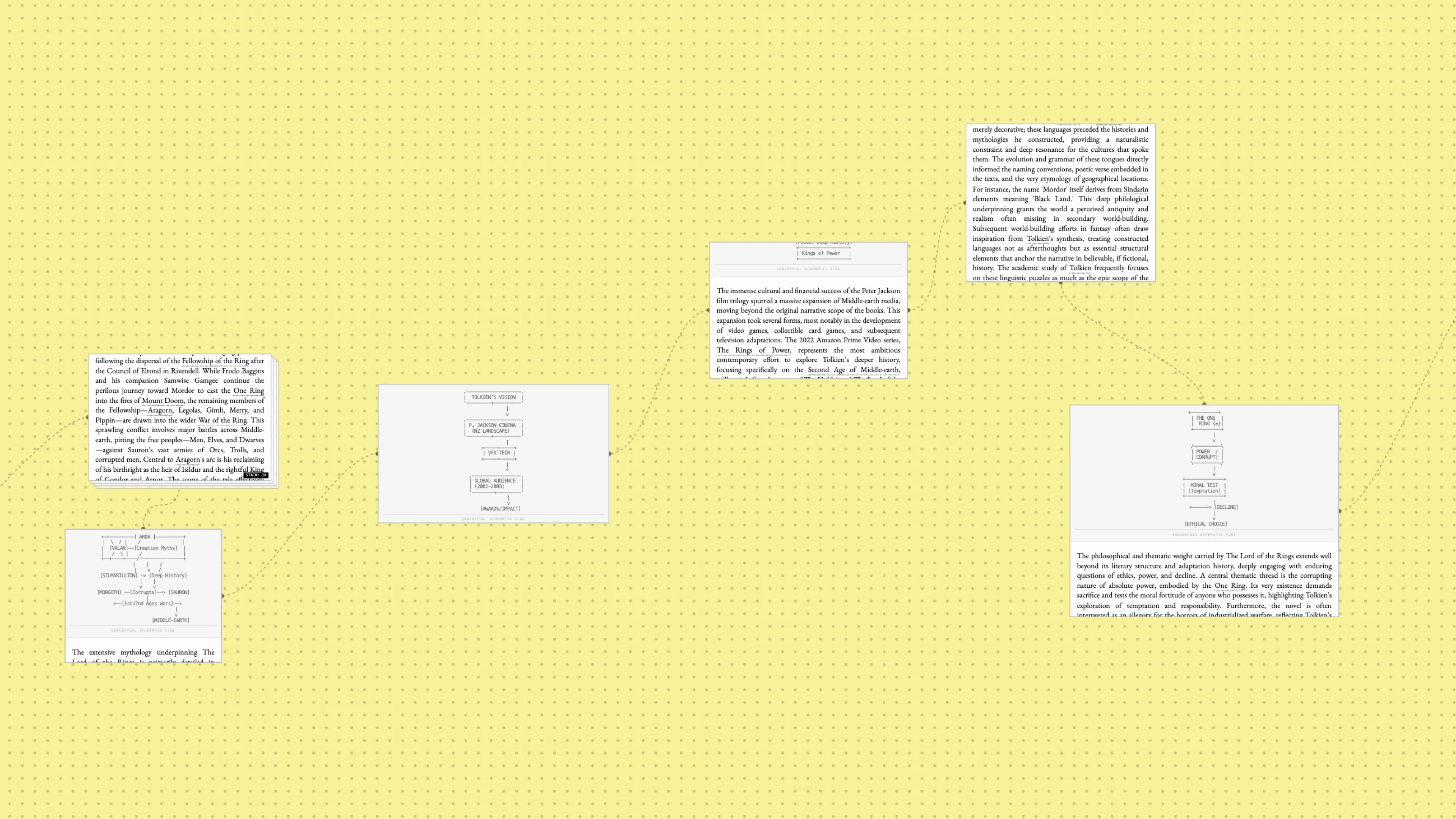
gridscape turns research and ideation from a conversation into a map. Instead of asking questions and getting answers in a single thread, you draw rectangles on an infinite canvas. Each rectangle becomes a node of synthesized knowledge, and each connection between nodes includes an explicit bridge of reasoning. You end up with a spatial document that shows not just what you've explored but how the ideas relate to each other. The interface uses ASCII schematics to visualize conceptual relationships, giving it a
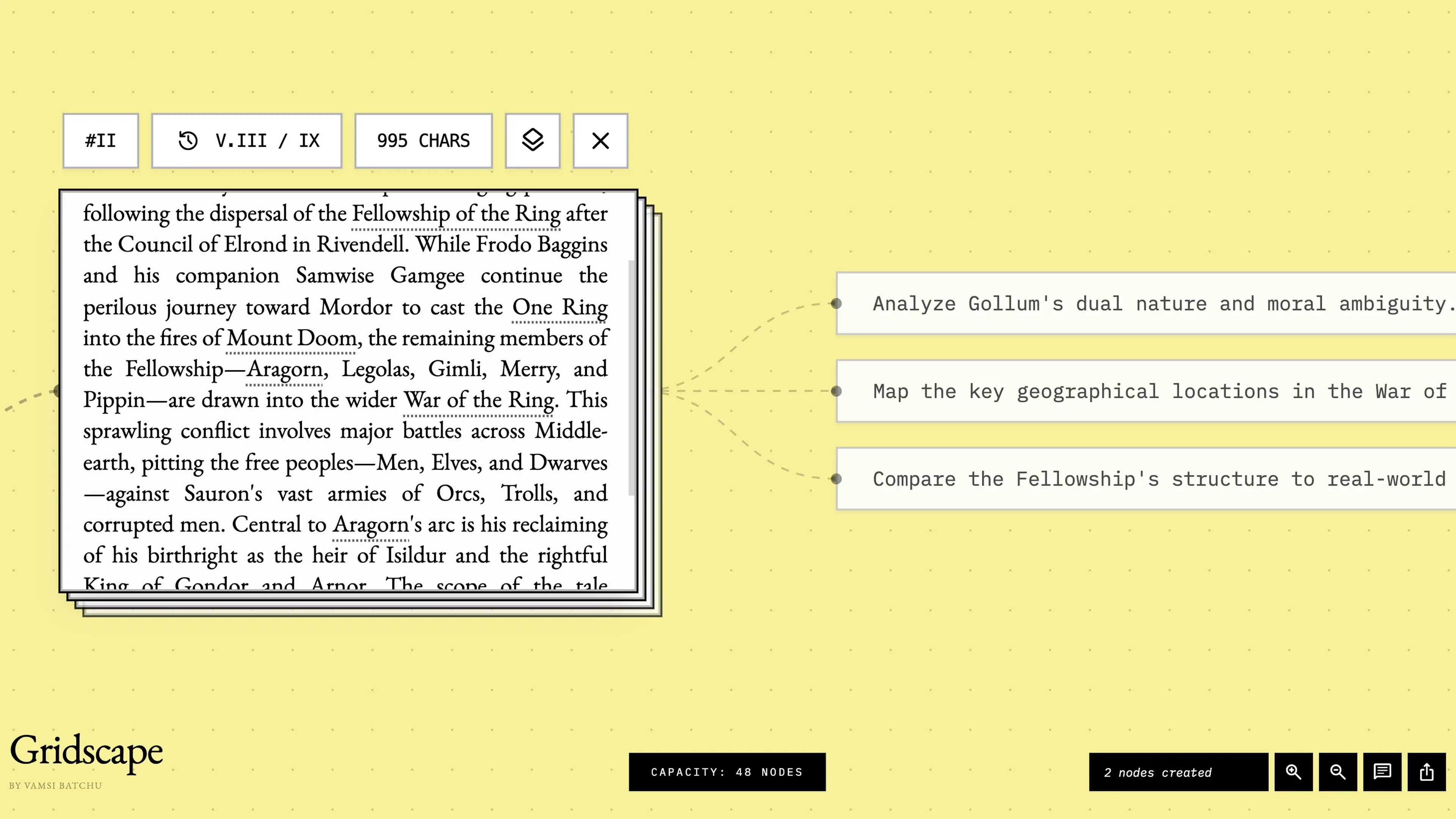
lo-fi, almost archival quality. This isn't just an aesthetic choice. It frames the output as working drafts rather than polished answers. Every node can have multiple versions. Every link explains why it exists. The result is a different way of thinking with AI. You're not prompting a chatbot, you're navigating a landscape. Draw a frame to synthesize something new. Follow a suggested path or make your own. The canvas grows with you and lets you get productively lost in the process.
worldwide transforms geography into an intelligence mission. Each round drops you into a global reconnaissance scenario where three cryptic clues point to a hidden country. The clues range from cultural facts and national symbols to environmental distinctions and historical quirks, challenging you to connect seemingly disparate pieces of information
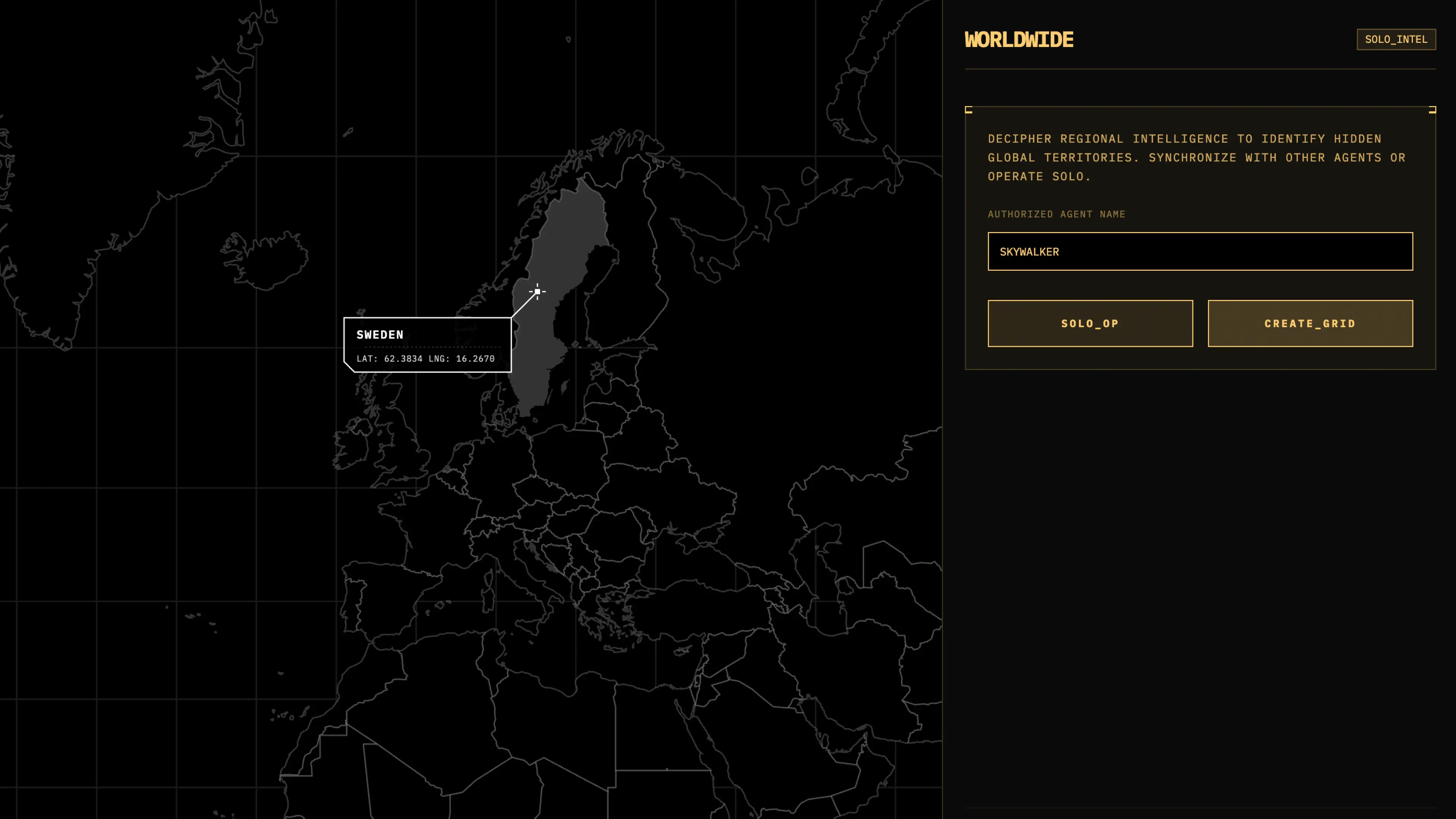
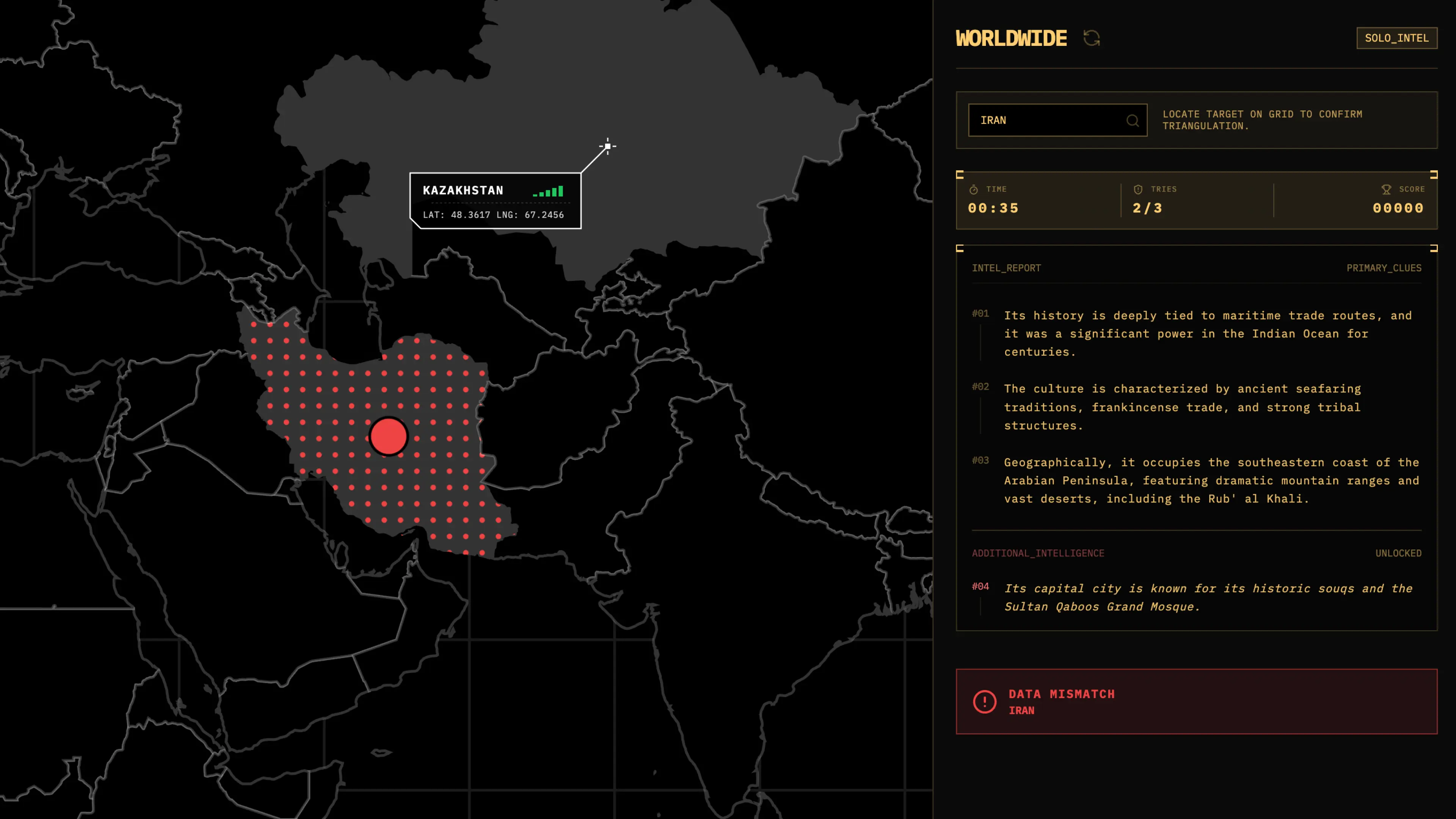
to pinpoint the correct territory on an interactive world map. The gameplay balances strategy with intuition. As you hover across countries on the dark, tactical map interface, a proximity meter signals how close you are to the target, shifting from red to green as you approach the answer. You have
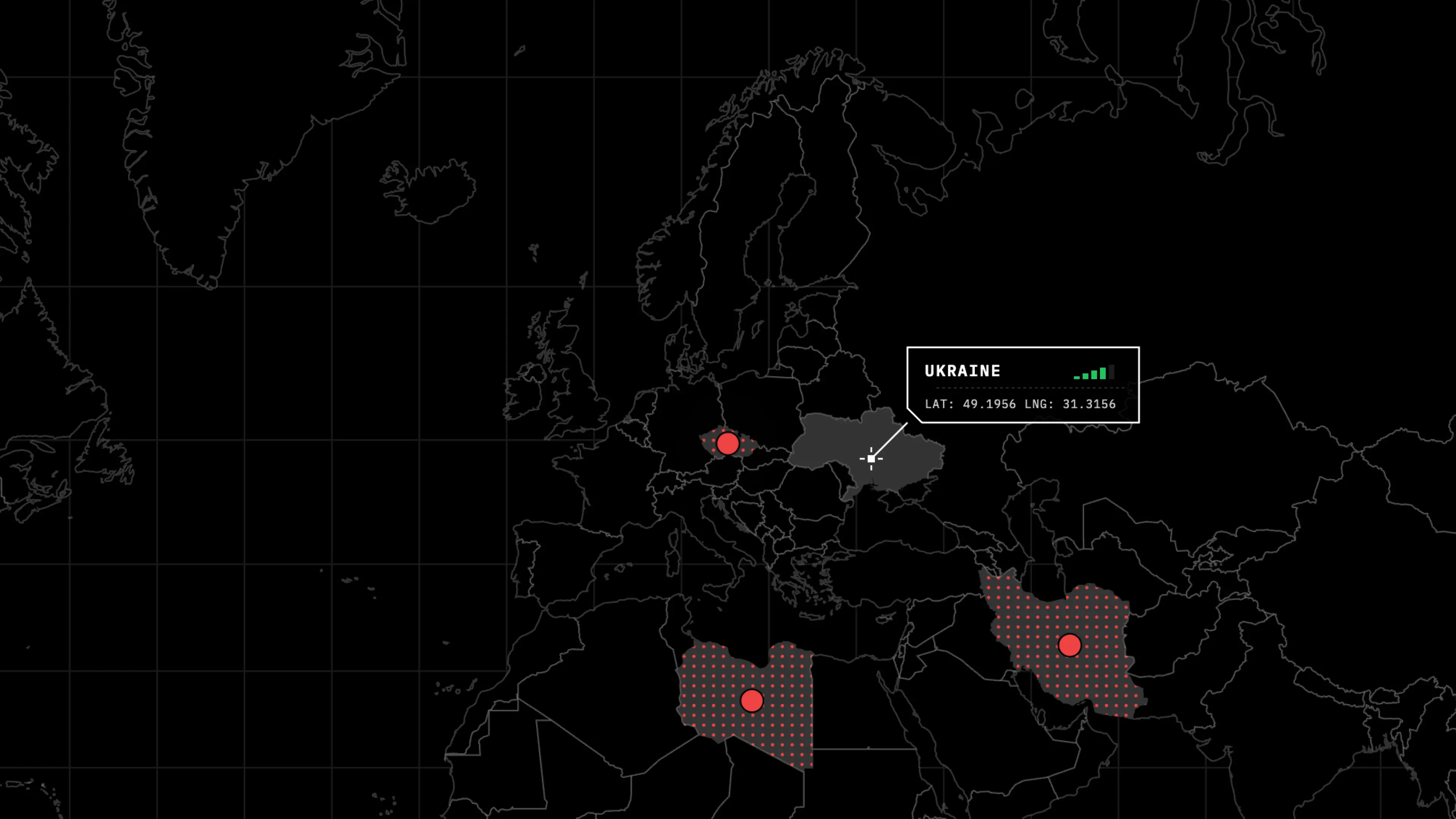
three attempts to lock in your guess, and each wrong selection reveals additional intelligence to help narrow down the location. The tension builds as tries dwindle and the clock ticks, turning each round into a race against both time and your own geographic blind spots. Whether you are brushing up
on world knowledge solo or challenging friends to see who can decode the intel faster, Worldwide makes learning about countries genuinely engaging. It is a game that rewards curiosity and pattern recognition, turning obscure facts about national dress codes, carbon footprints, and mythical nicknames into memorable moments of discovery.
elemental began as a simple question: what if the periodic table could answer back? Instead of memorizing elements in isolation, I wanted to build something that lets you explore chemistry the way scientists actually think about it. Start with a material you encounter every day, ask what it's made of, and watch the fundamental building blocks reveal themselves. The reverse search flips
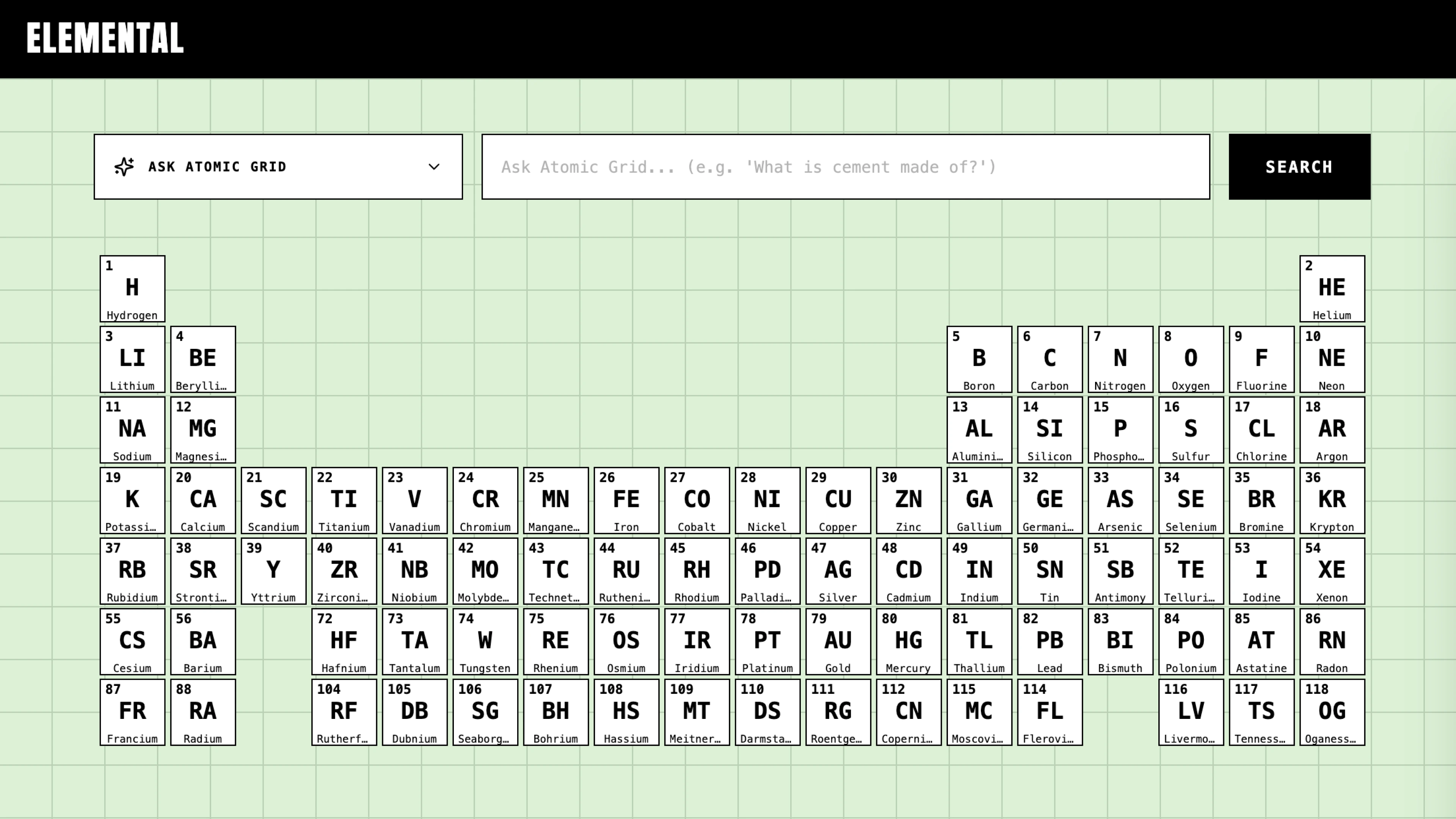
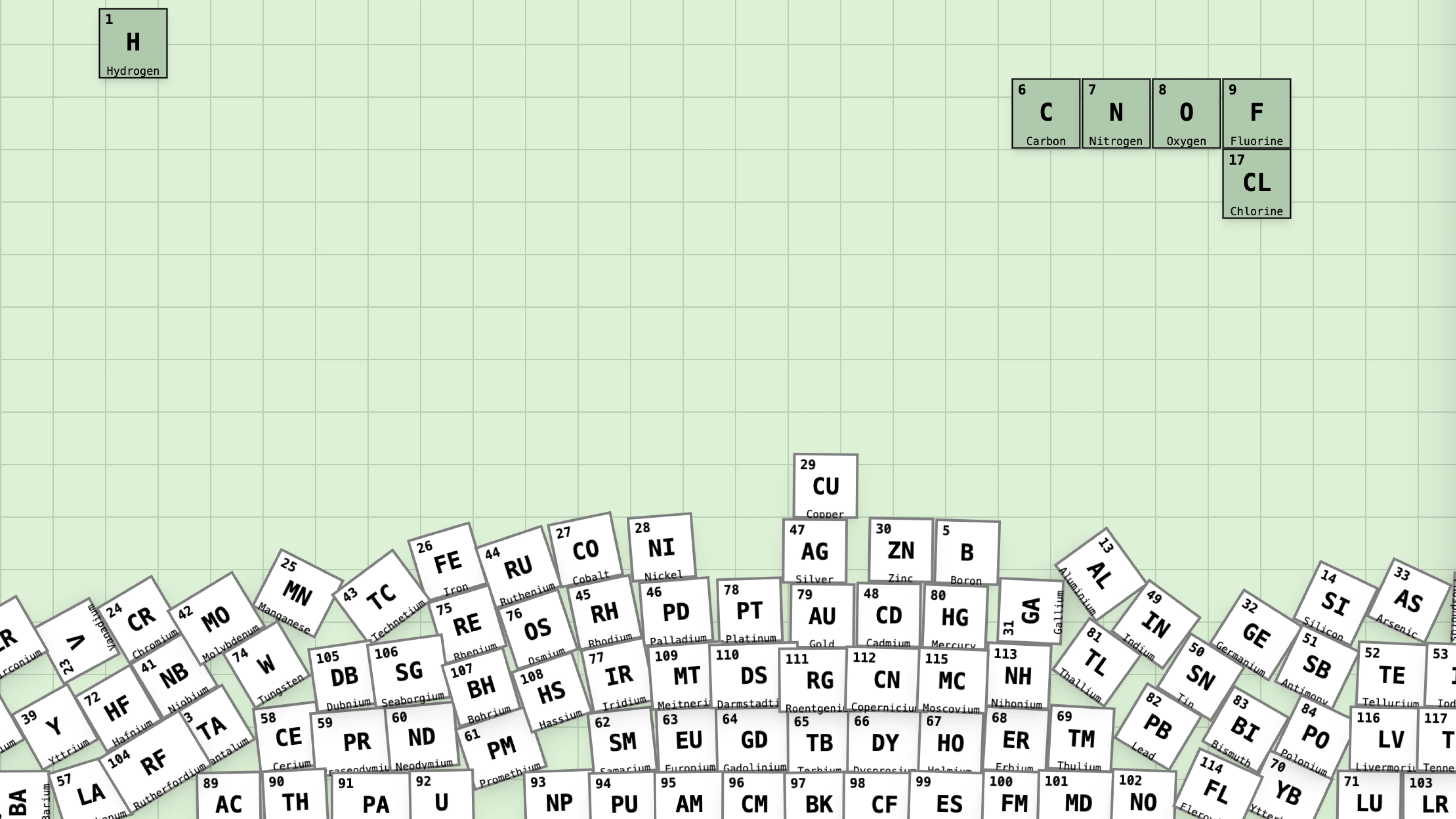
the traditional approach on its head, turning passive learning into active discovery. The physics simulations emerged from a desire to make abstract concepts feel tangible. When irrelevant elements fall away during a search, it's not just a visual trick. It's a reminder that chemistry is about relationships and reactions, not static facts on a chart. The element relationships feature takes this further, letting
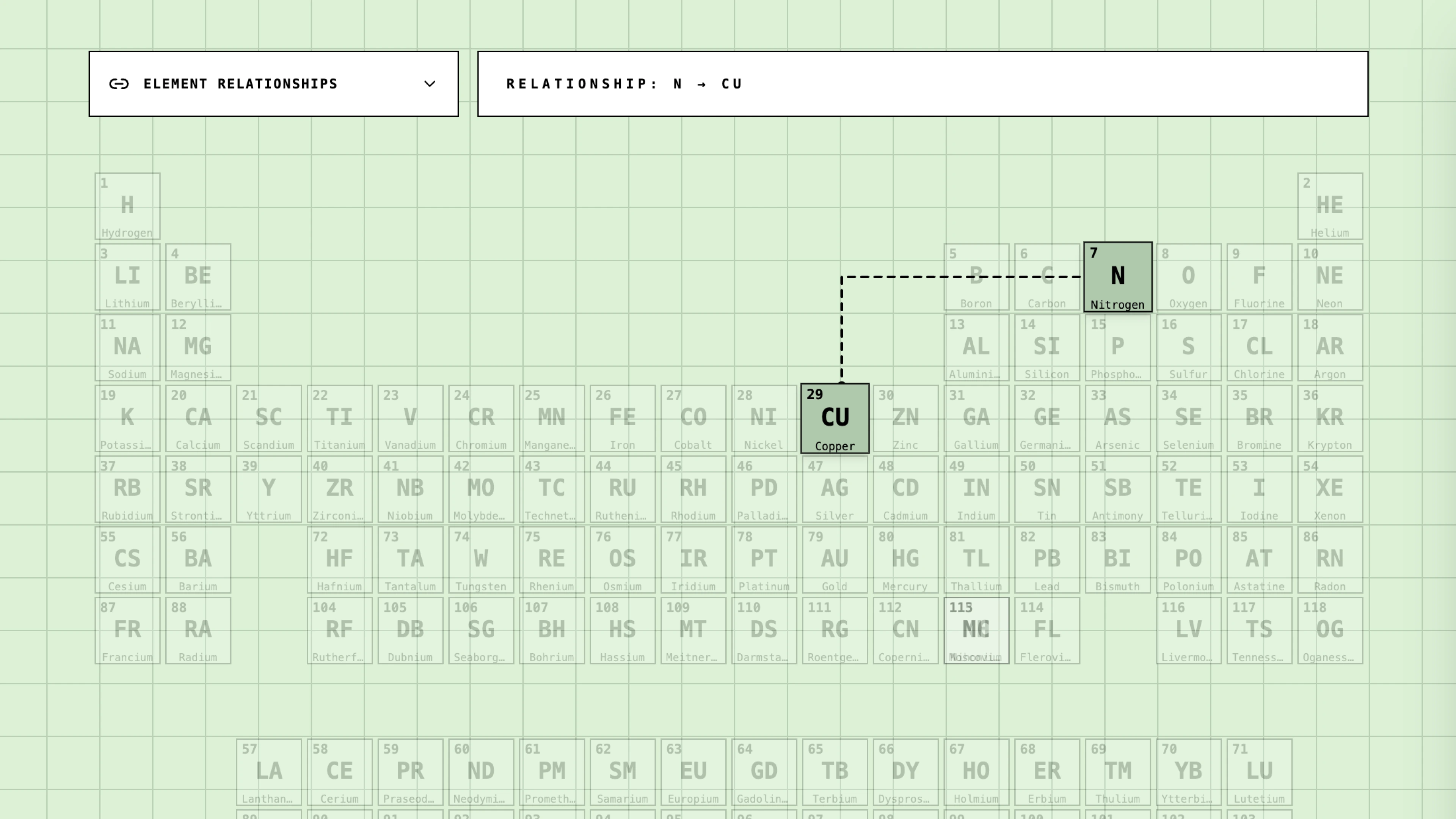
you pair any two elements and explore how they bond, what compounds they form, and where those materials show up in the real world. Zirconium and boron might seem obscure until you learn they combine to create materials that survive 2000 degrees Celsius in jet engines. This project is an ongoing experiment in making science more intuitive. Every feature is designed around a
simple principle: understanding emerges from interaction, not instruction. Whether you're a student trying to grasp why sodium reacts violently with water or just curious about what's inside your phone screen, Elemental aims to turn that curiosity into genuine comprehension. The periodic table is a map of everything that exists. This app is an attempt to make that map worth exploring.
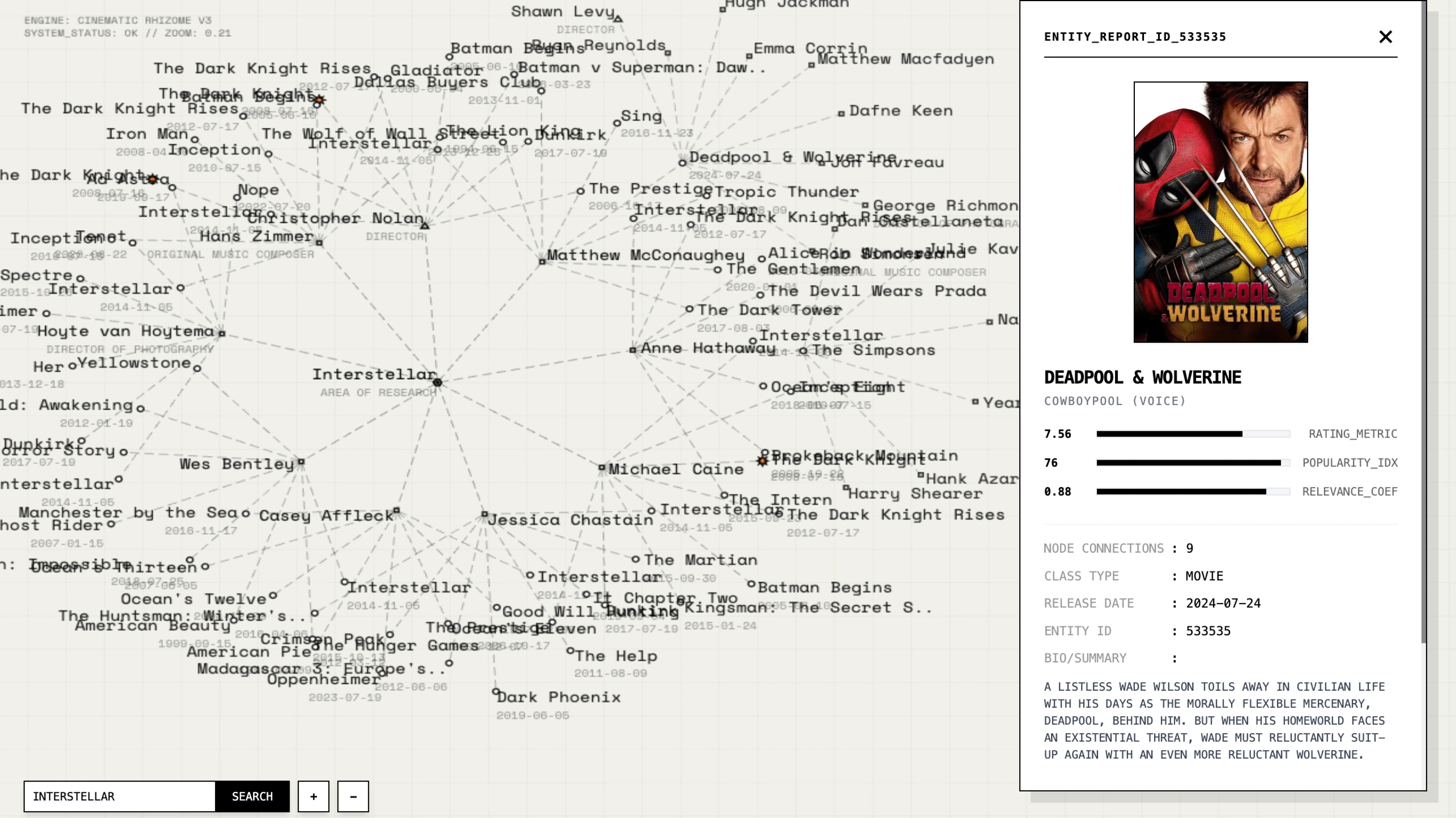
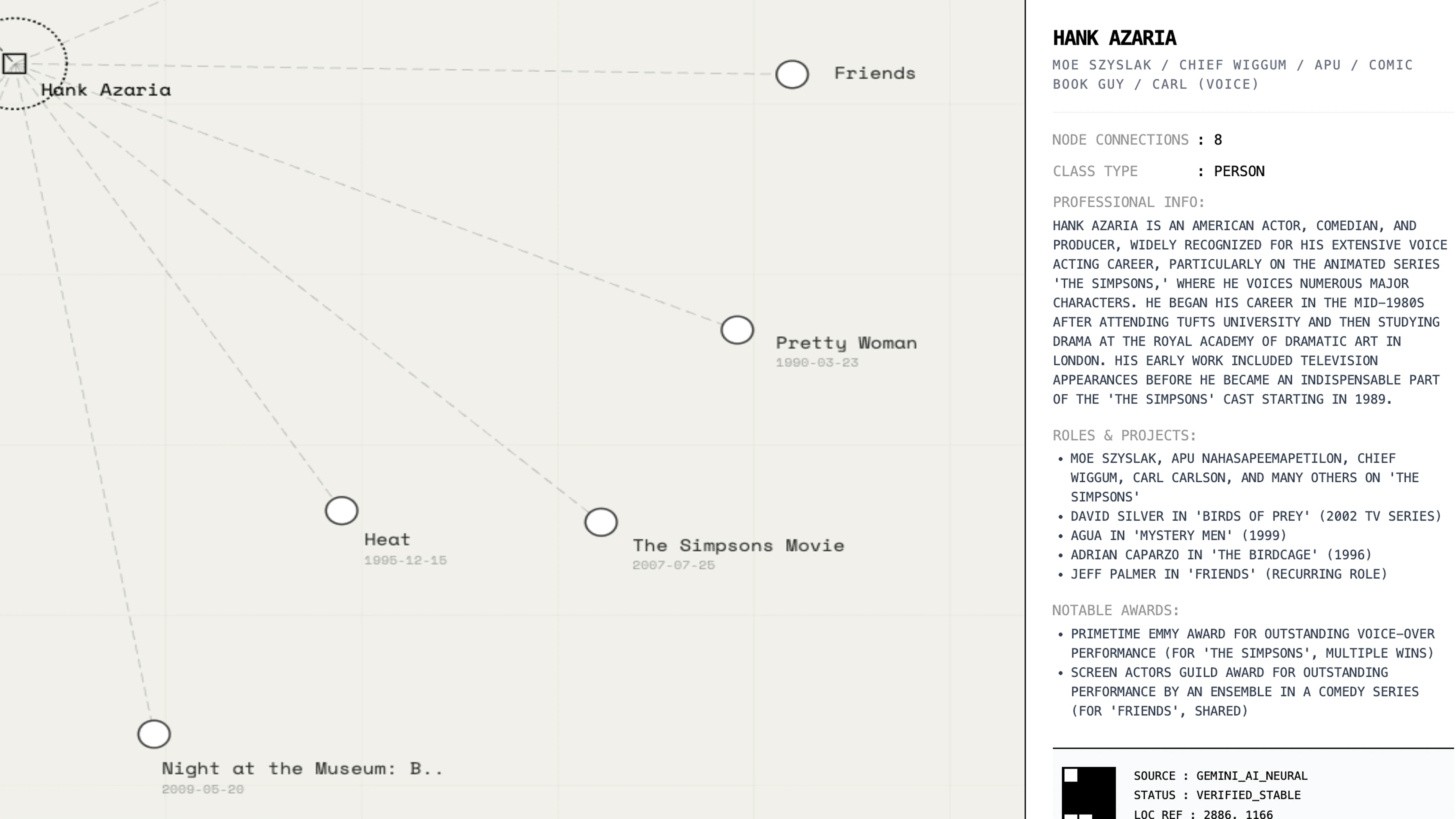
Canopy is an interactive visualization that maps the hidden architecture of cinema. Enter any actor, director, composer, or film title and watch as a procedural tree grows from your query, its branches tracing the web of collaborations and creative connections that define the industry. Each node represents a person
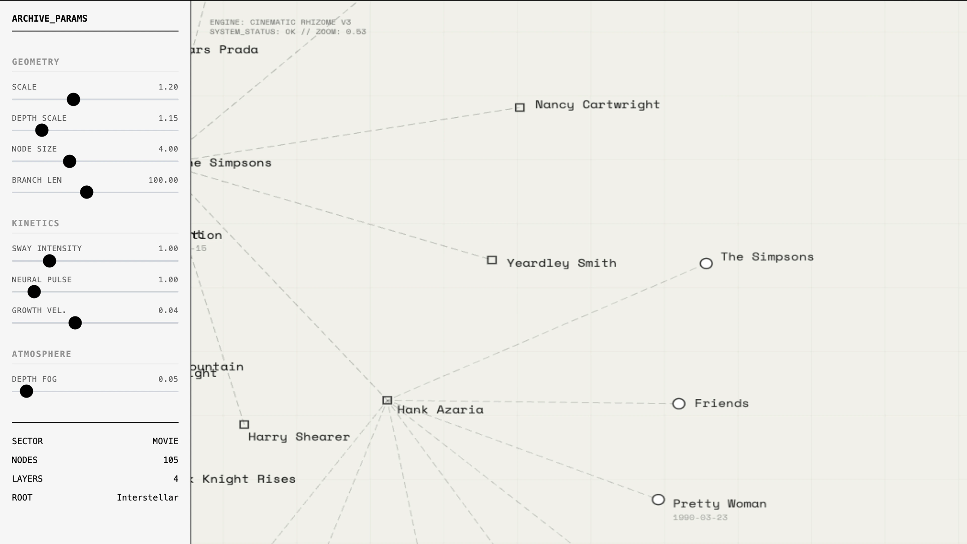
or a film, and clicking any node reveals its metadata while letting you re-root the entire tree from that new perspective. The visual language borrows from data art and generative design. A left panel exposes the underlying parameters that control how the tree grows: branch angles, length variance, scale reduction,
node sizing. You can manipulate these in real time, watching the structure reorganize itself. The aesthetic is deliberately monochromatic and technical, treating film industry data with the same visual rigor as a botanical diagram. What emerges is something like a family tree for cinema. Search for Christopher Nolan and see
his filmography branch outward, each film spawning clusters of collaborators who connect to their other works. The tree makes visible what we intuitively know but rarely see mapped: that cinema is a dense network of relationships, and every film exists within a living ecosystem of creative partnerships.
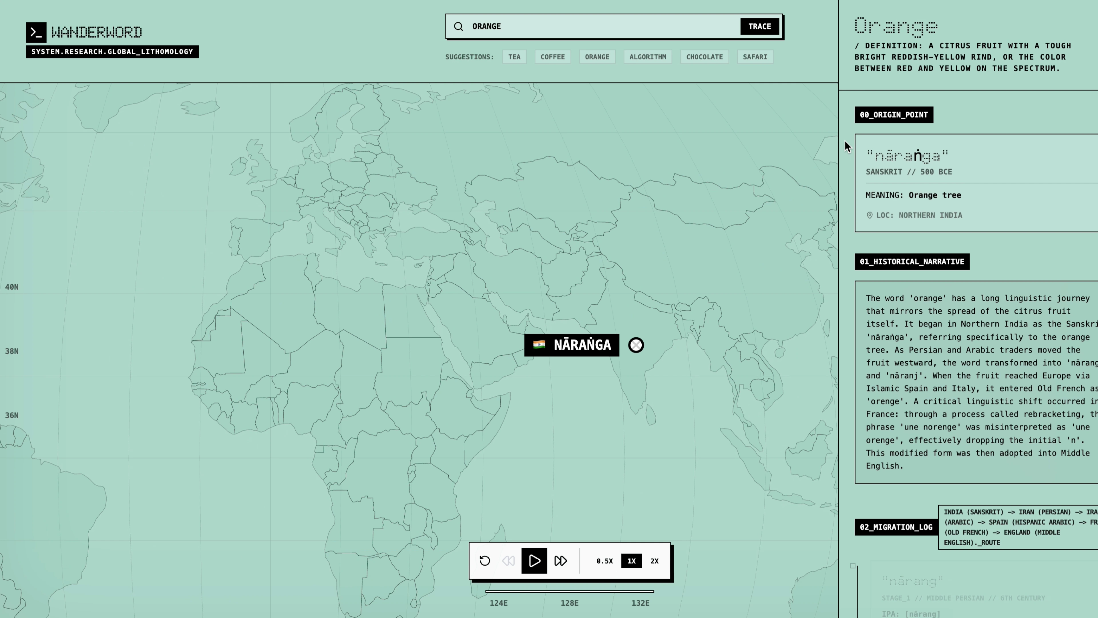
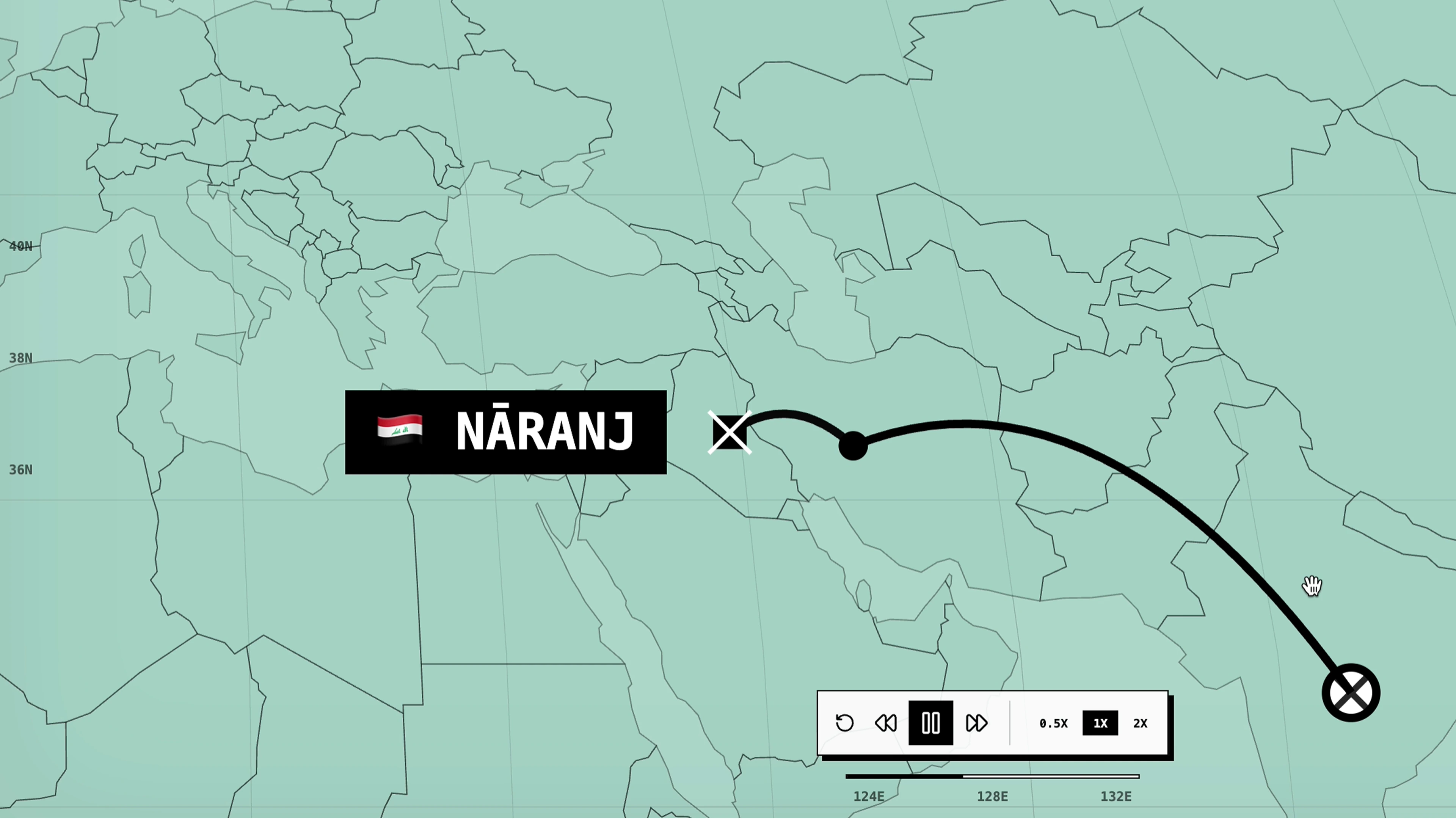
every word you speak is a traveler. wanderword visualizes the hidden migrations of language, tracing how words journeyed across continents through trade routes, conquests, and cultural exchange. Type any word
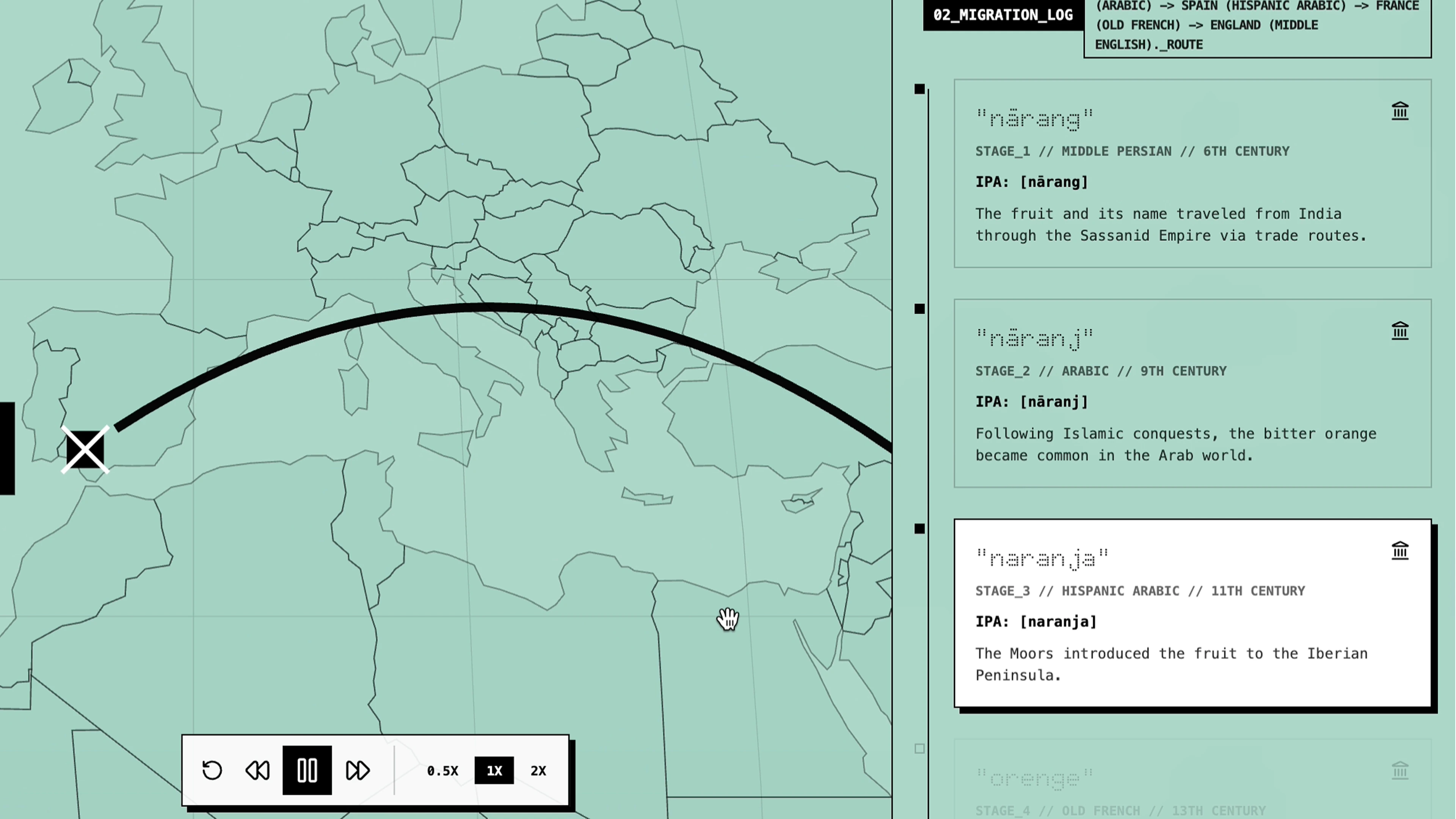
and watch its path unfold on an interactive world map. The tea in your cup tells two stories: one that traveled by Dutch ships from Fujian province, becoming "tea" across
maritime Europe, and another that moved overland through the Silk Road, transforming into "chai" across Persia and India. Powered by Gemini, the app reconstructs the linguistic archaeology of everyday words.
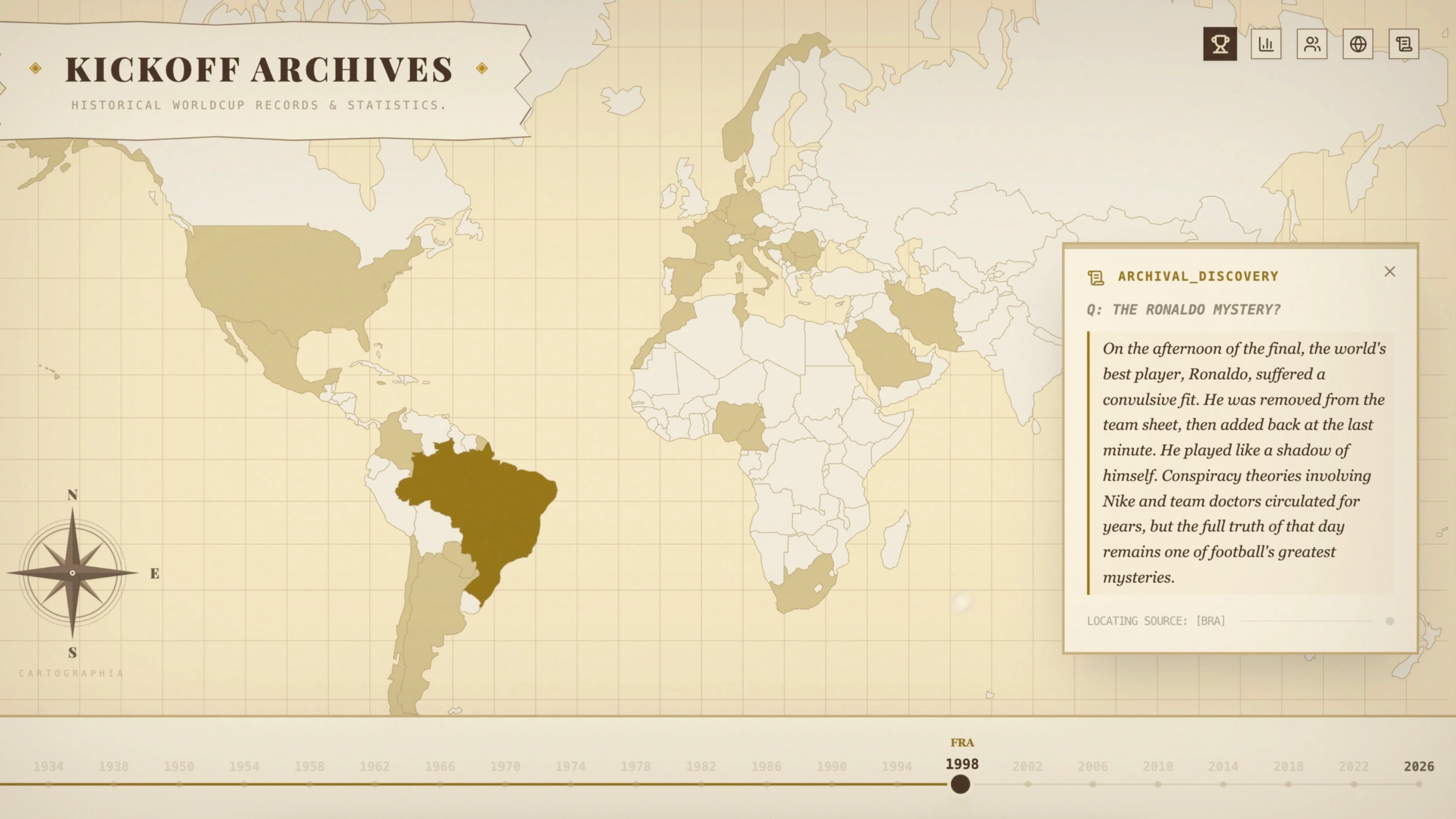
kickoff’26 acts as a comprehensive digital repository for World Cup history. It uses a visual language of vintage cartography to present global football statistics through an
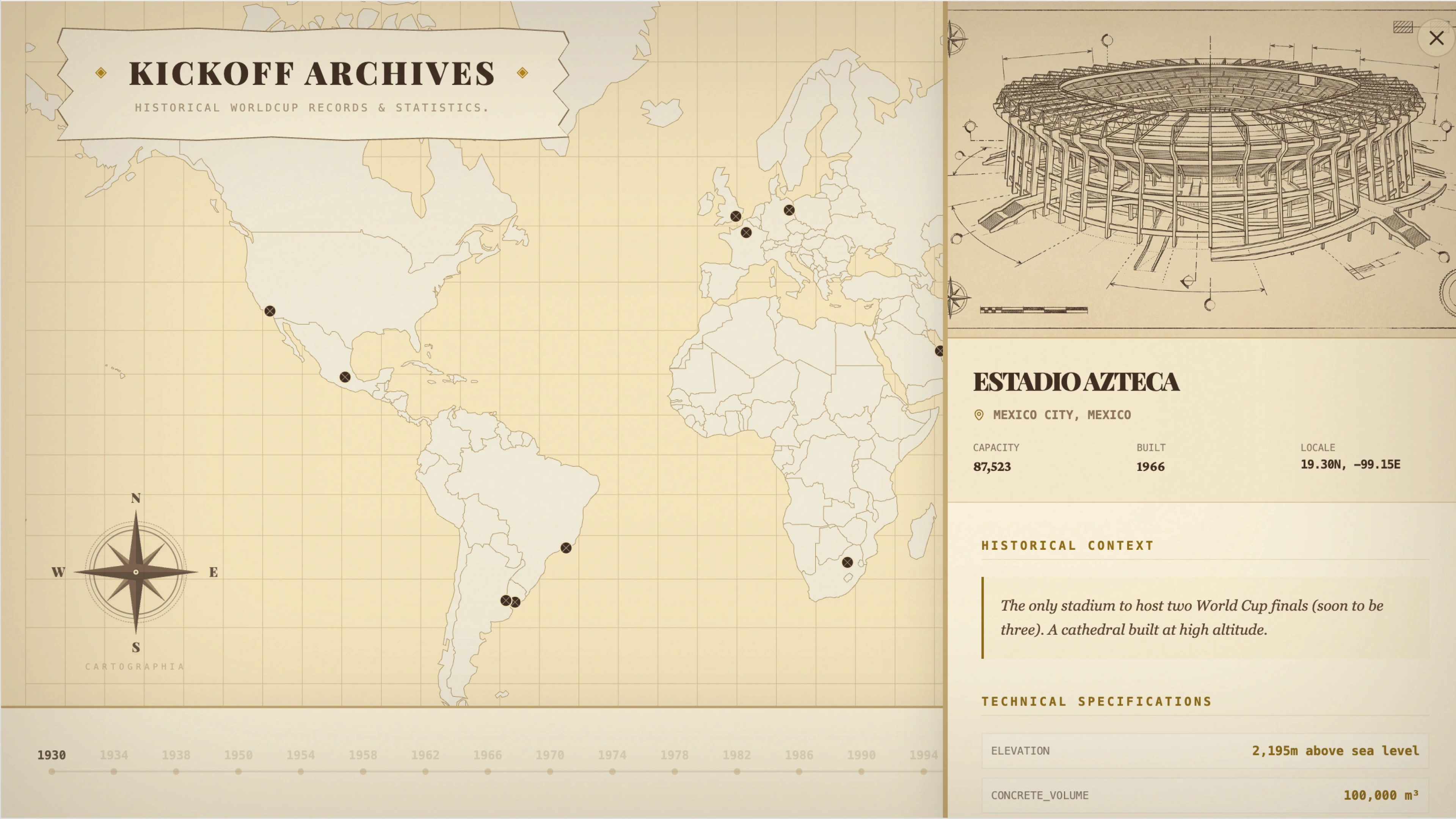
interactive map interface. By marrying classic archival aesthetics with modern data processing, the platform offers a unique way to traverse nearly a century of tournament records
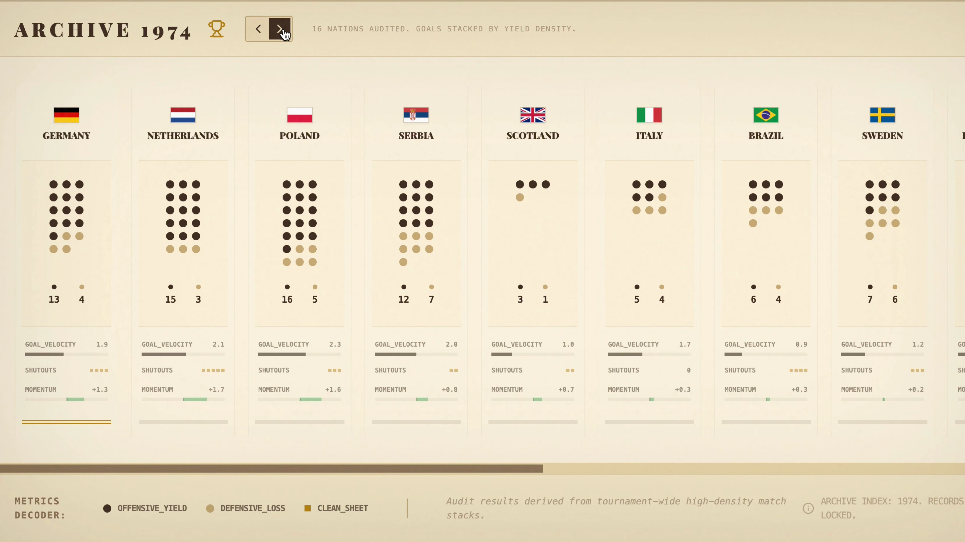
from 1930 to the present day.The interface provides specialized viewing modes to explore distinct aspects of the sport, including championship distributions and squad demographics.
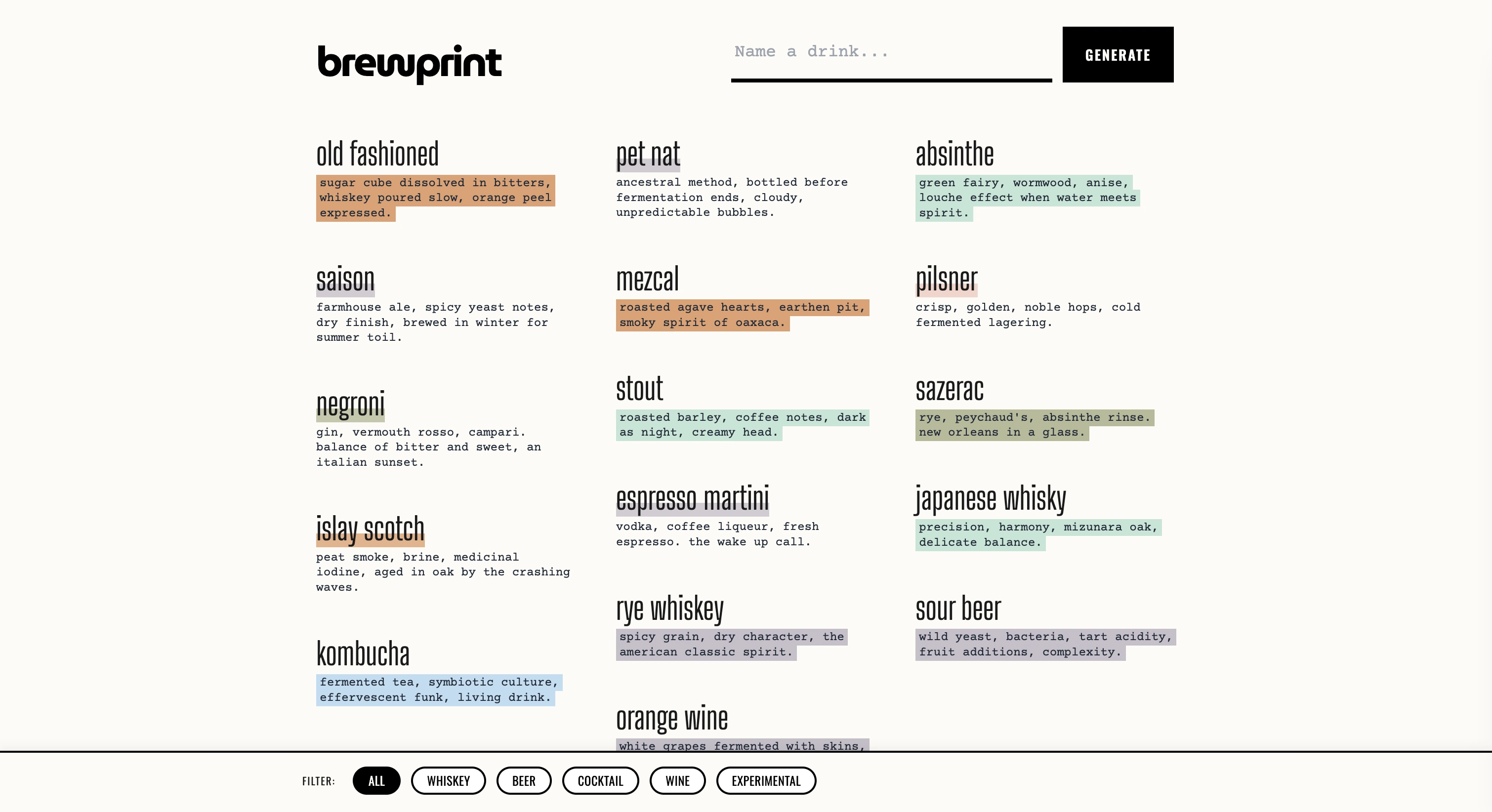
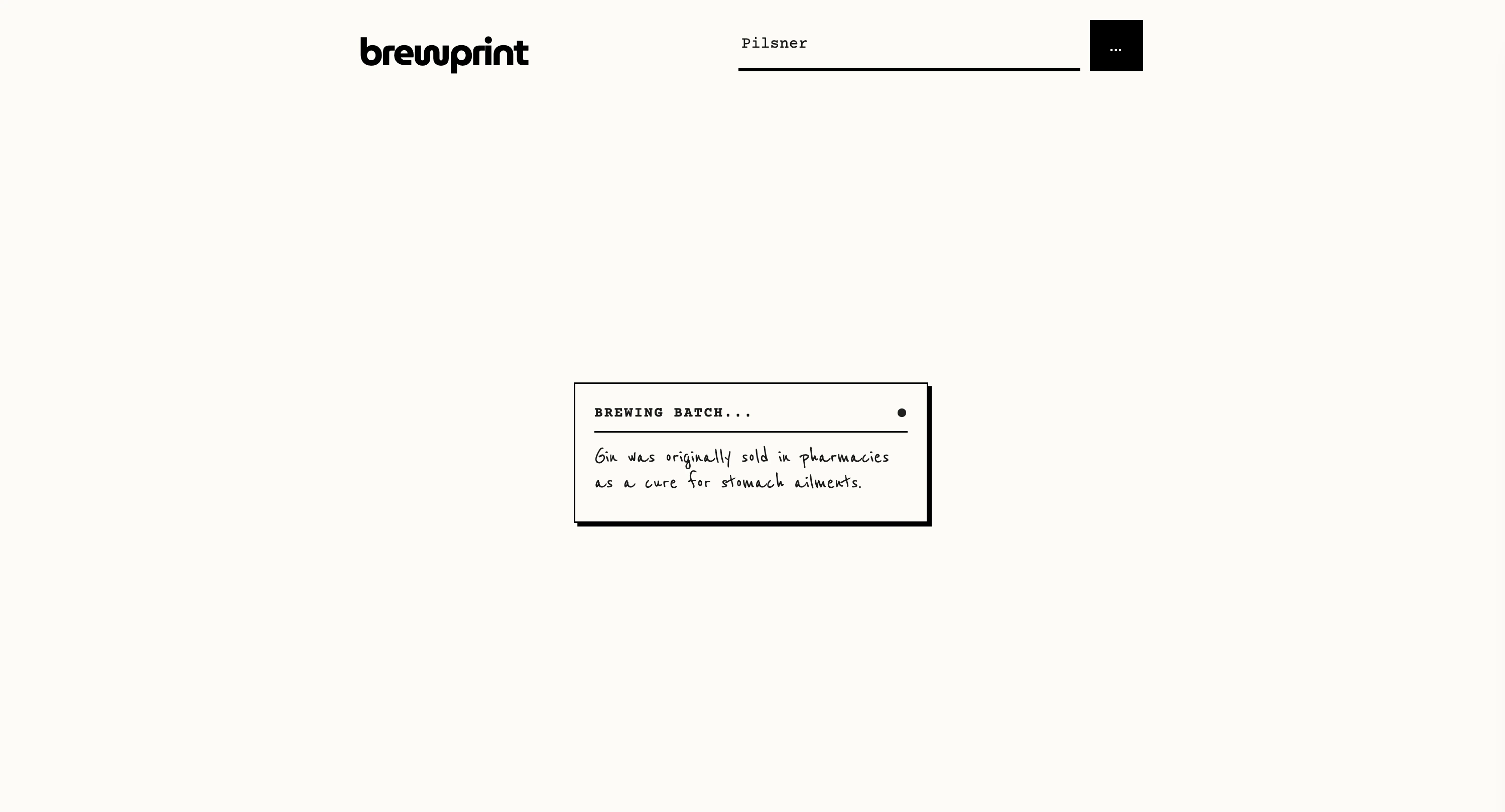
brewprint is an interactive design application that reimagines beverage exploration by blending a raw, industrial aesthetic with advanced generative AI. It transforms simple drink queries into beautifully detailed, "artisanal" product labels that look like vintage specification sheets. The interface opens with a unique "scrapbook" style
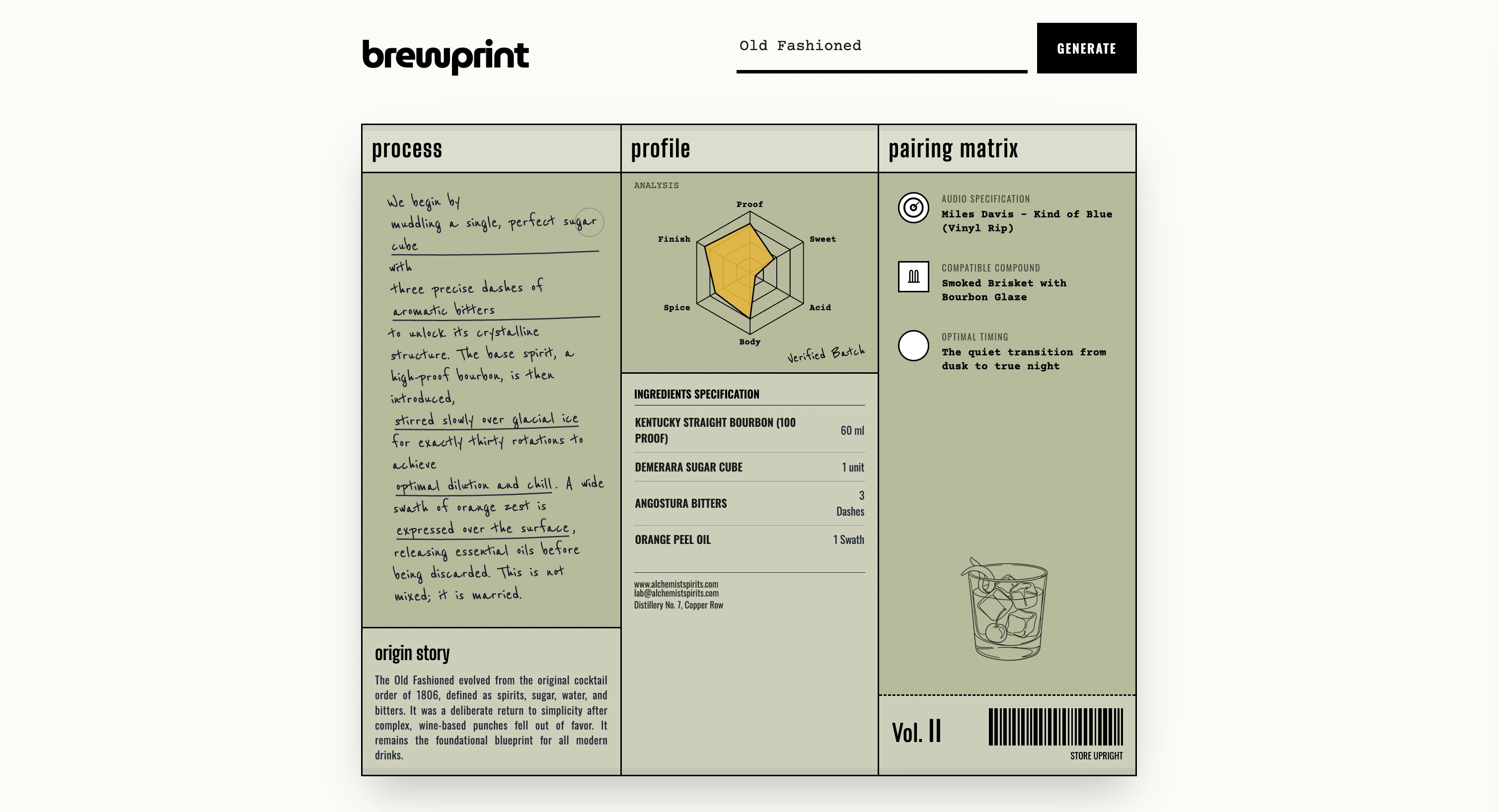
landing page, featuring a masonry grid of curated drink inspirations and category filters, all set against a backdrop of clean typography, high-contrast design elements, and a stark, brutalist visual language. Beyond standard recipes, Brewprint generates a comprehensive "identity" for every drink using Google's Gemini models.
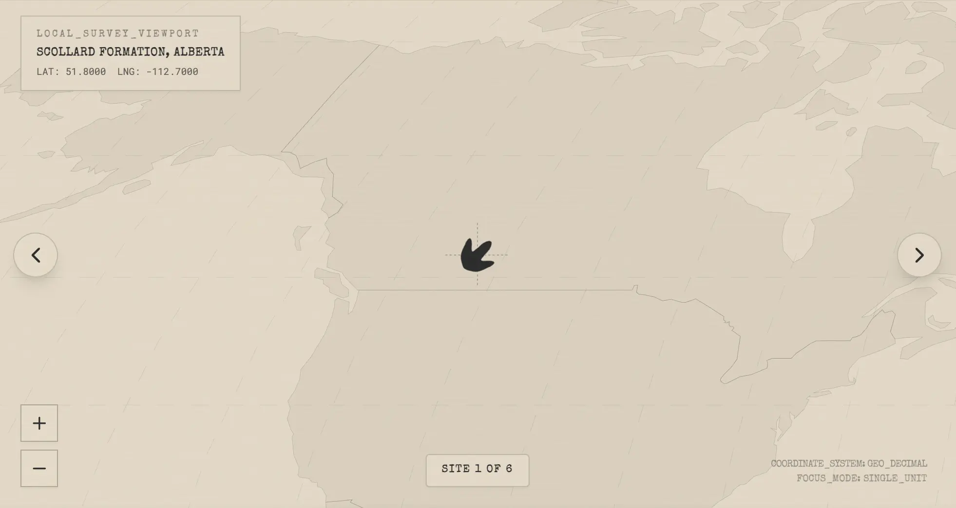
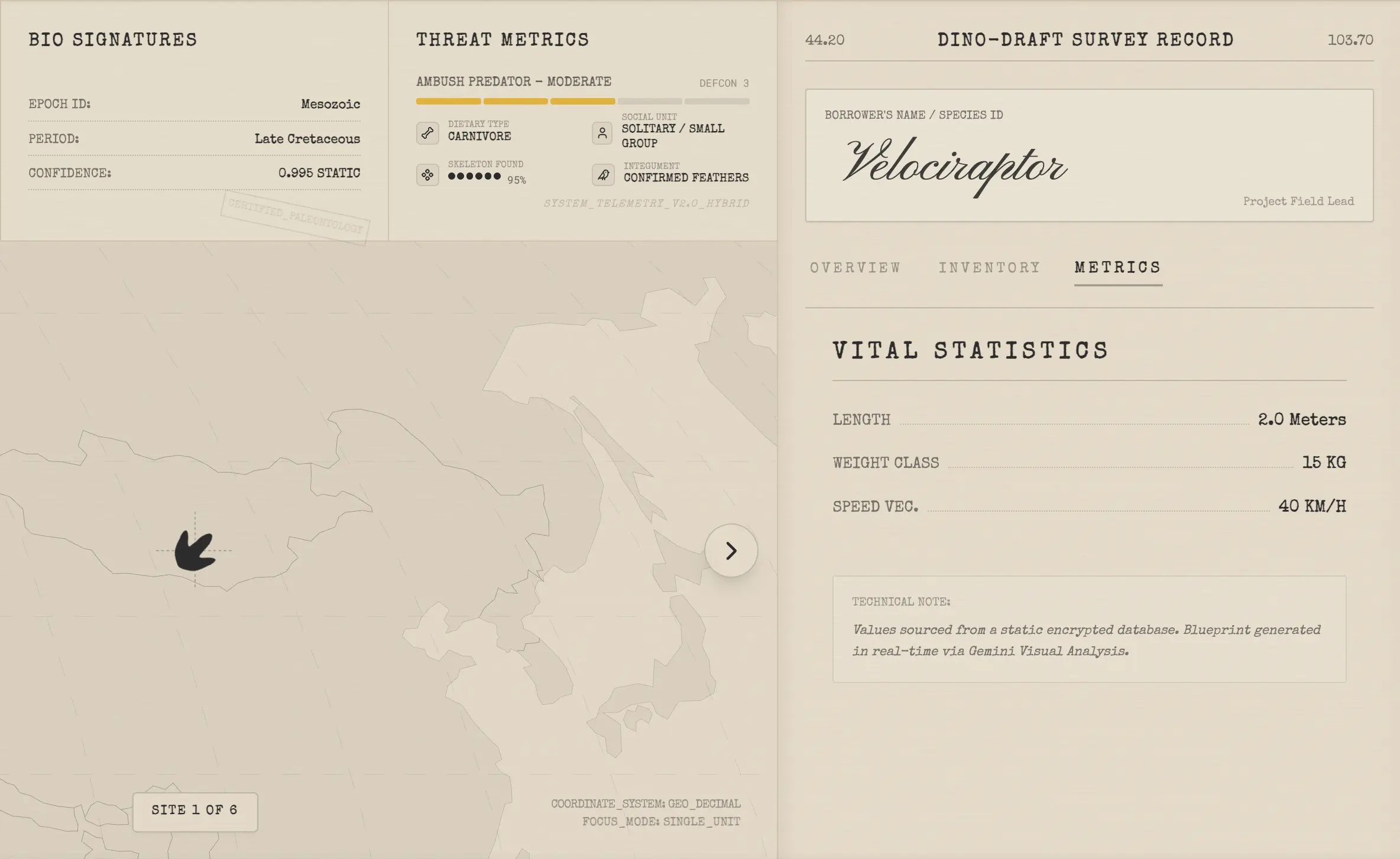
dino draft is an immersive, technical visualization tool designed to simulate a high-tech paleontological field survey. It aggregates global fossil data into a stylized "blueprint" interface, allowing users to explore the prehistoric world through the lens of a researcher. The application transforms raw data into a cohesive dossier, presenting detailed records of dinosaur species—ranging from the Tyrannosaurus Rex to the Microraptor—in a distinctively tactical, manila-folder aesthetic. At the heart of the experience is an interactive, D3-powered global map that acts as a central command hub. Users navigate through geological formations—from the Hell Creek Formation to the Gobi Desert—using a responsive coordinate system. Selected sites pulse with a custom sonar-like ripple
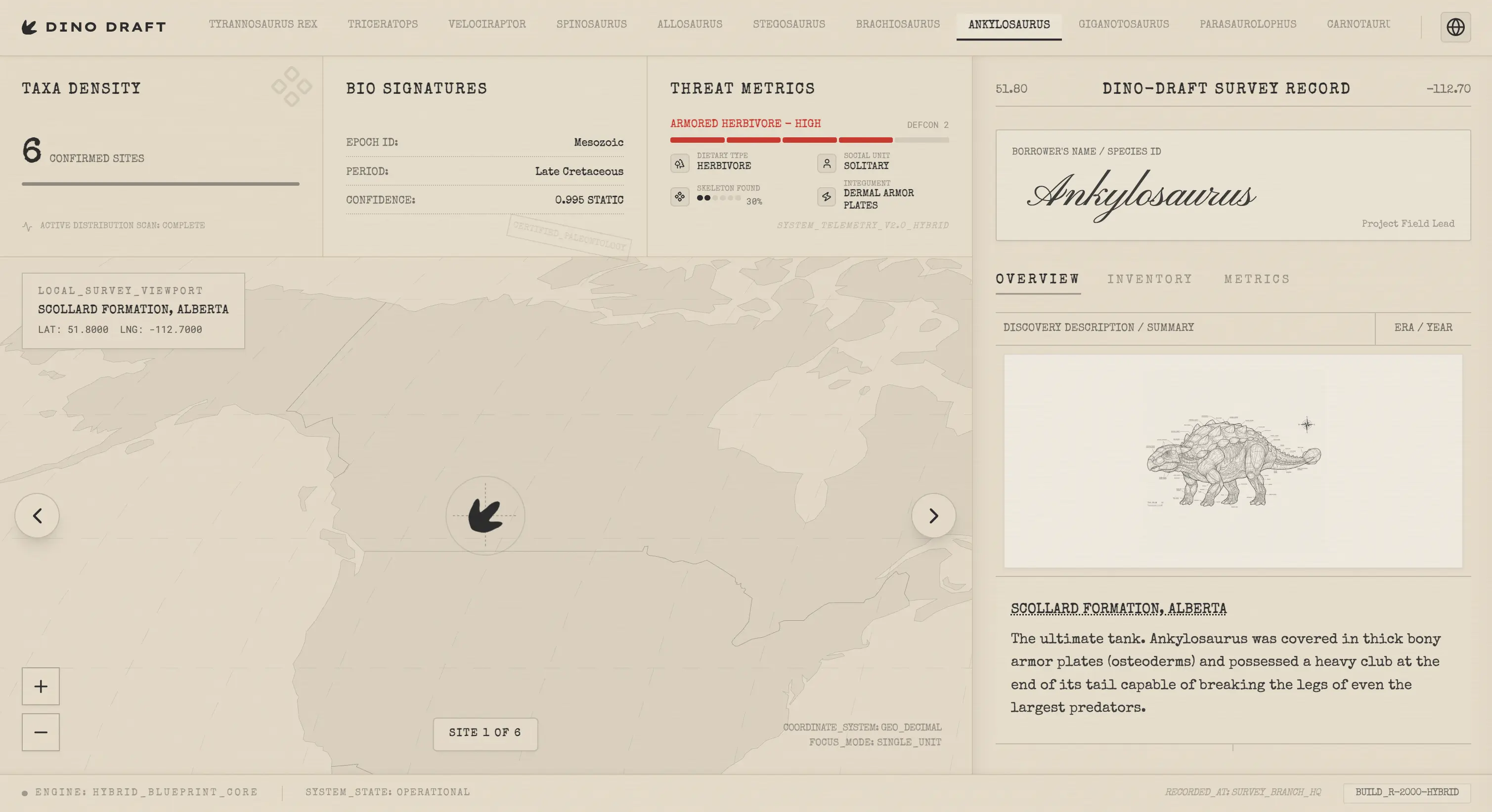
effect, visually anchoring the user to specific excavation points while providing immediate geographic context. The interface emphasizes technical precision, utilizing typewriter fonts and vector-style iconography to maintain the atmosphere of a classified scientific archive. The application leverages the power of the Google Gemini API to dynamically generate high-fidelity, monochromatic scientific illustrations for each species, rendering them as "schematic blueprints" in real-time. Beyond visuals, the system breaks down complex paleontological data into digestible metrics, including threat levels, osteological completeness, and geological context. This combination of generative AI, rich datasets, and atmospheric UI creates a unique educational platform that feels less like a textbook and more like a field operative's terminal.
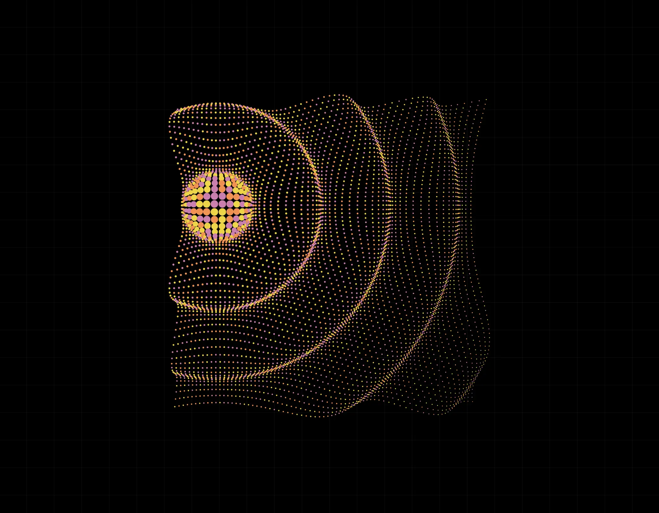
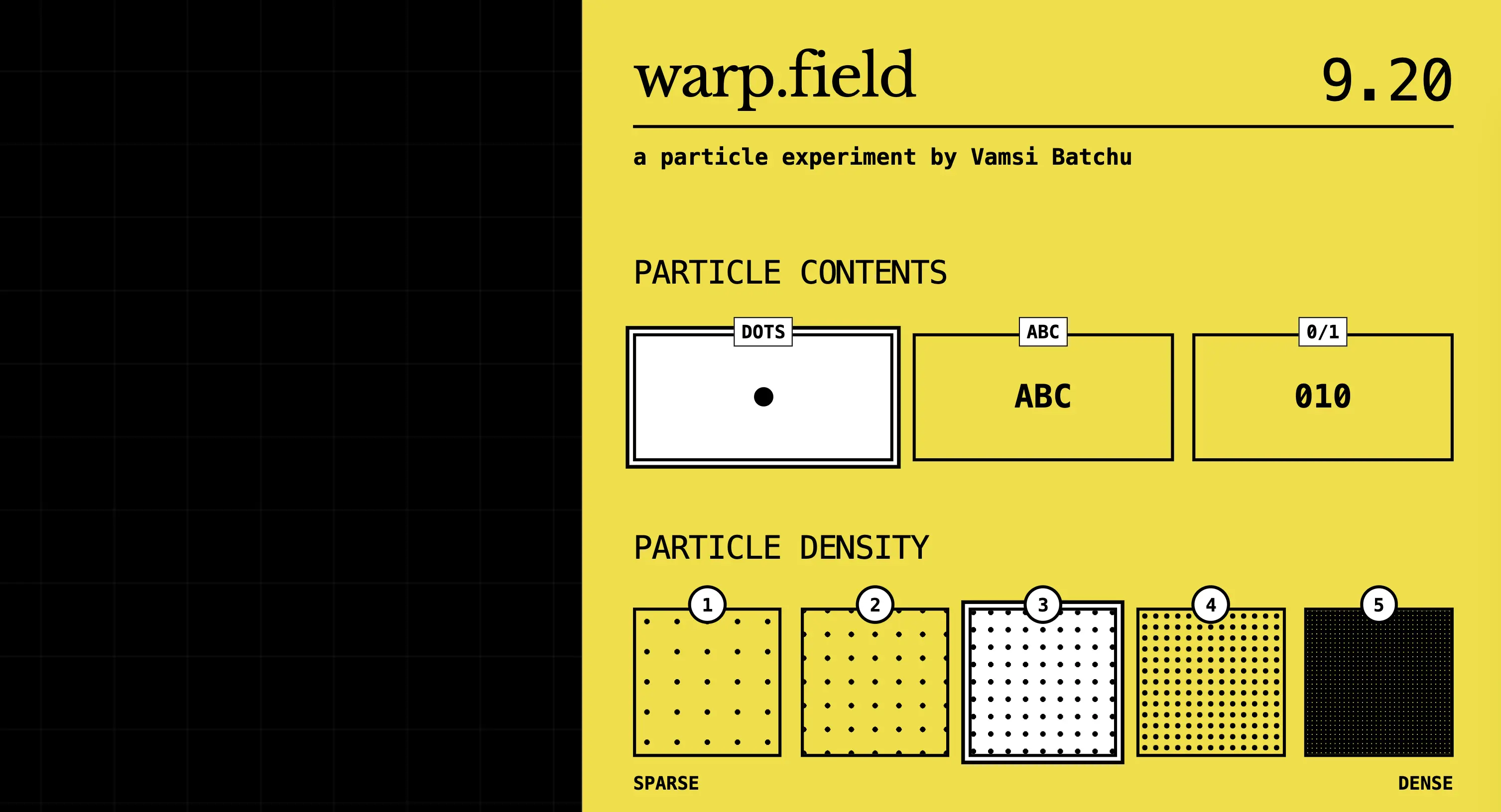
Warp Field is an interactive particle simulation that transforms static grids into fluid, reactive geometry. Built with React and p5.js, the application renders a field of thousands of individual points—customizable as simple dots, ASCII characters, or binary code—that respond dynamically to cursor movement. Users can manipulate a distortion lens that ripples through the grid, creating organic, topographic patterns that mimic physical displacement forces in real-time. The experience is elevated through a sophisticated audio-reactive engine powered by the Web Audio API. By analyzing frequency data, the grid visualizes sound as physical force: sub-bass frequencies generate a rotating vortex and propagating sine waves from the center, while high-frequency
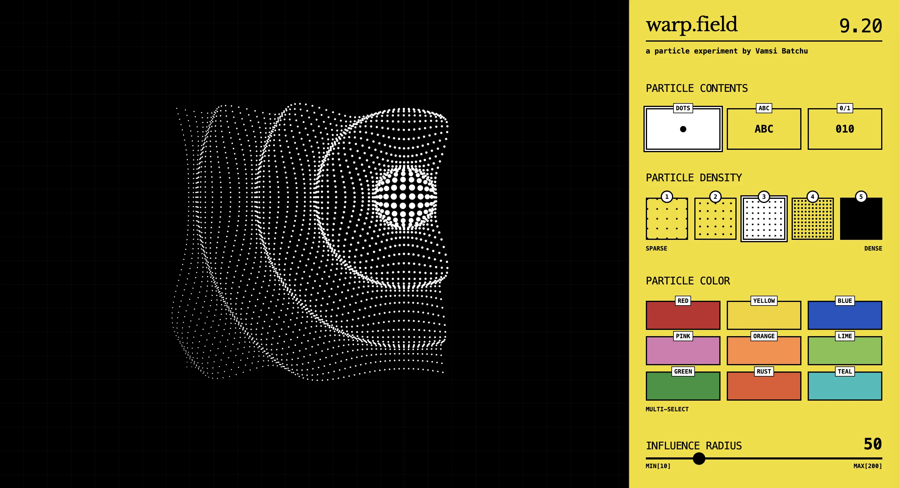
transients introduce jitter and kinetic energy. During intense musical moments, a dynamic "constellation" algorithm activates, drawing transient wireframe connections between neighboring particles to create complex, pulsing geometric structures synchronized to the beat. Designed with a brutalist, high-contrast aesthetic, the interface provides deep control over the simulation's physics. Users can fine-tune the damping factor to switch between rigid, snappy motion and liquid, viscous flows, adjust the chaos level of the distortion, and select from curated color palettes to tint the particle field. Whether used as a meditative visualizer or a high-energy graphics experiment, Warp Field offers a playground for exploring the intersection of code, math, and music.
The Shape of You is a typographic video mirror that transforms your silhouette into digital art for Valentine's Day. Using real-time webcam
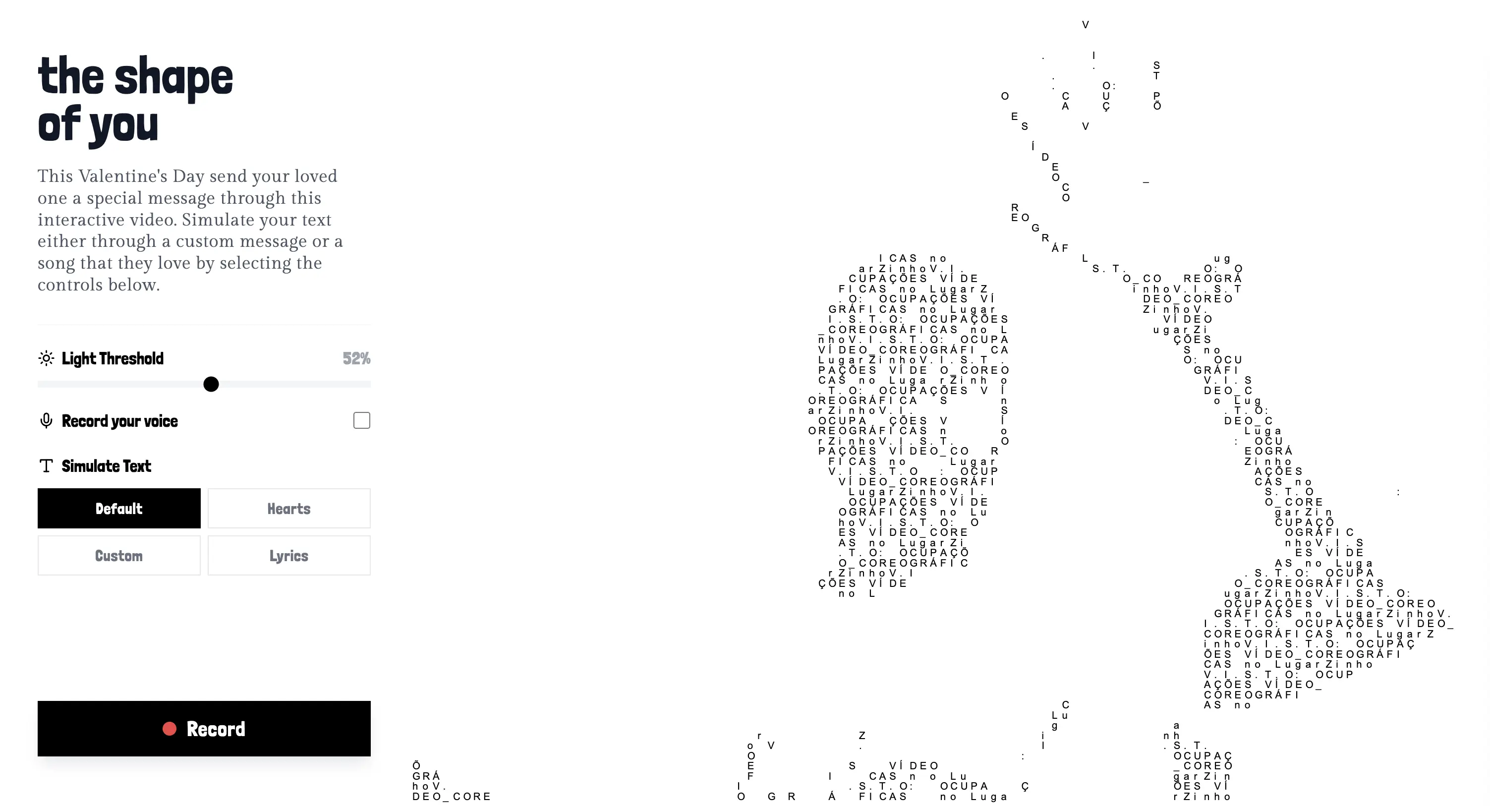
processing, it reconstructs your image with dynamic text to create a "living letter" effect. The minimalist, high-contrast aesthetic—driven by elegant typography—allows users
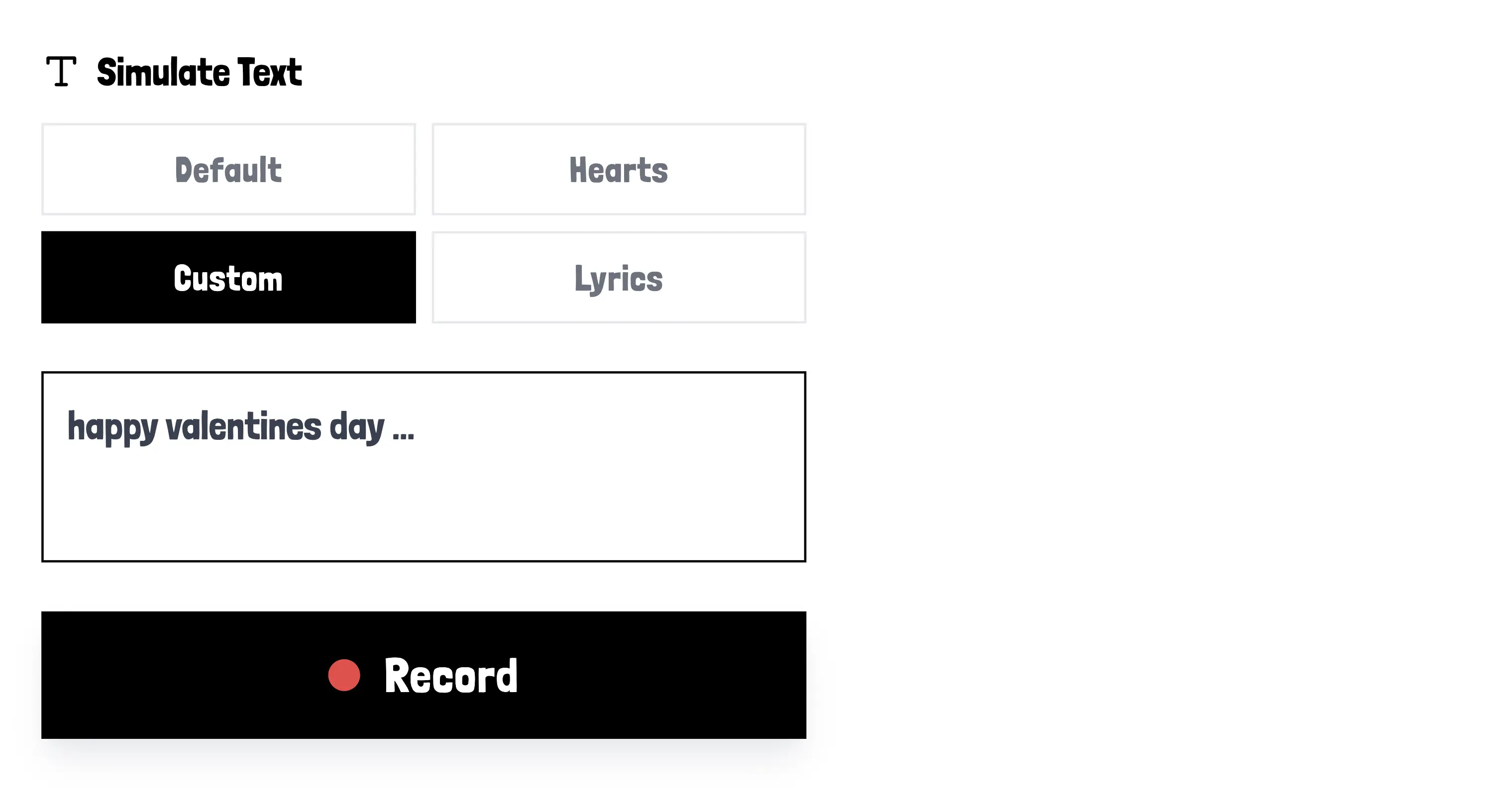
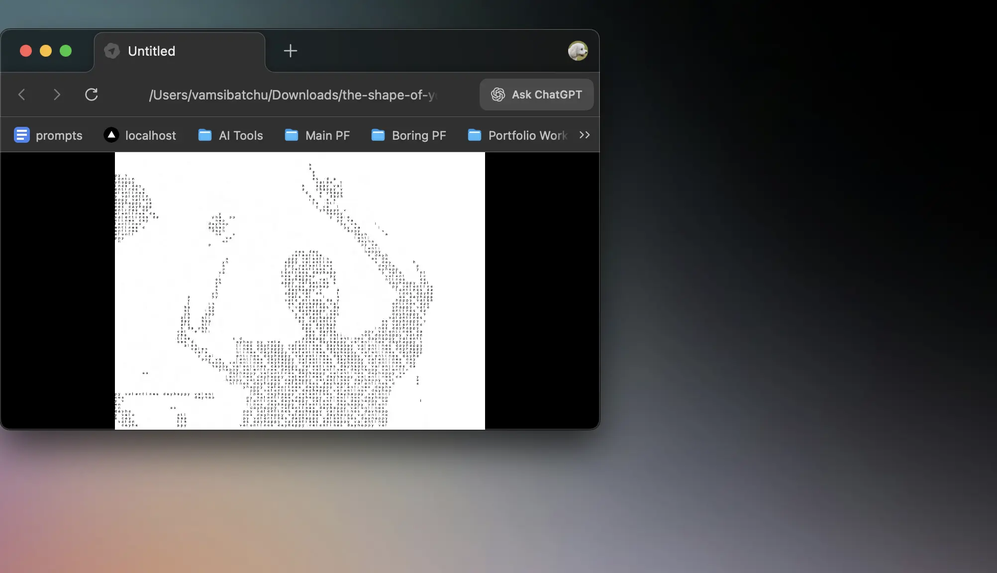
to see themselves rendered through the very words they wish to convey. With four text modes, users can choose from heart symbols,
custom messages, or Gemini-powered song lyrics to serve as the visual "ink" for their silhouette in a poetic visual performance
lens watch is a a geo-guessing game where you hunt for locations using Google Street View Image hints. As a player
lens watch
of the game, you will have to solve the location based on the image hence within a set time by selecting
an area of the map and guessing that it is the right location, you will have 5 chances to discover the
right location using the images provided. Built with maps API & gave it Assassin’s Creed aesthetics using a JSON.
for my next experiment in the text effects series, went all in with computer vision
based interactions with dynamic text layouts & hand tracking.you can use pinch/drag gestures to manipulate
the workspace directly using your hands that makes the interface feel like a physical object.
type_effects
push flow introduces a tactile, editorial interaction where clicking highlighted words slides the text body to reveal inline imagery. Set against a vibrant yellow background,
push flow
the layout maintains a classic document structure while integrating modern, responsive animations. This interaction style allows users to explore supplemental content, such as Tolkien-inspired maps
and photos, without losing their place in the narrative. The "push" mechanic ensures that every transition feels smooth and physically grounded within the digital space.
Tree pop allows users to create and customize a procedural forest with hand-drawn aesthetic elements. Users can plant unique trees by dragging rectangles on the canvas, choosing from various leaf
colors and adjusting structural parameters like branch length and height. The environment features a dynamic wind simulation that causes the trees to sway realistically, accompanied by birds that occasionally fly
across the dark green landscape. A specialized building mode enables the placement of wobbly, jittered structures with randomized windows to create a unique urban skyline behind the foliage.
tree pop
text hover
Enter experiment
description here...
newyorkover
Enter experiment
description here...
dinodex is a nano-app that lets you turn your favorite dinosaurs into '90s Pokémon-style trading cards. There are over 100 dinosaurs to collect through the platform. You can search for any species to view its trading card, which features a
dinodex
consistent Pokémon-inspired theme. Each card provides detailed information about the dinosaur's type, powers, and traits, as well as its discovery location. The app also maps every species on a world map based on where the dinosaur was originally located.
summit scout
Summit Scout is an app built for national park adventures. While many of us love our national parks, there isn't a single
app that visualizes all 63 U.S. national parks in a truly enjoyable way. This app allows you to explore every park by
gathering comprehensive data and scoring them on factors like remoteness and scenery. It combines logistics, directions, camping information, ratings, and community intel
into one seamless experience. You can also switch between different interactive views to explore the national parks in unique ways.
Enter
experiment
net runner
description
here...